
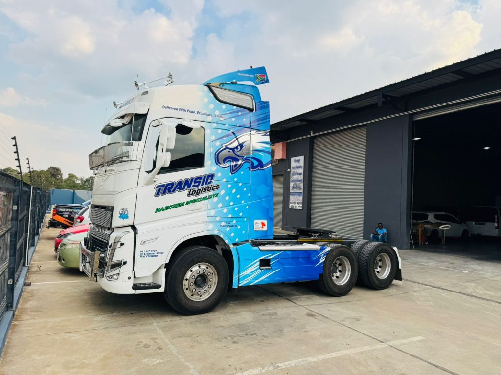
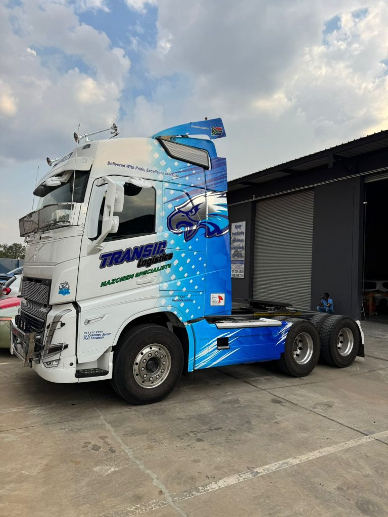
When Transid Logistics approached us about branding their fleet, they had a clear goal: create a refreshed visual identity that would stand out on South African highways while communicating their commitment to excellence and reliability. What resulted was a striking blue and white design that transformed their truck branding into powerful mobile brand ambassadors.
Here’s how we brought their vision to life.
The Truck Branding Design Process
We started with understanding Transid’s brand identity and what they wanted to communicate. Their existing brand featured a stylized eagle element that we knew needed to be a focal point. From there, we developed a concept that would maximize visual impact while staying true to their brand values.
Color Selection: We agreed to go with a vibrant blue as opposed to the red they used before as the primary color, a shade that’s both eye-catching and professional. Blue conveys trust and reliability, essential qualities in logistics. The gradient effect from light to dark blue adds depth and movement, creating visual interest without overwhelming the design. White panels provide contrast and balance, preventing the design from feeling too heavy while offering space for essential information.
Dynamic Design Elements: The flowing lines and dot patterns create a sense of motion and energy, reinforcing the “in motion” aspect of their tagline. These elements wrap around the cab’s contours, following the truck’s natural lines to create a cohesive, three-dimensional effect. The subtle South African flag that came with the truck design reinforces their local presence and national pride.
Typography and Information Hierarchy: The company name “TRANSID Logistics” is prominently displayed in bold lettering that’s legible from a distance. Their specialization “MACHINERY SPECIALISTS” is clearly visible in contrasting green, immediately communicating their niche. Contact information and registration details are strategically placed for visibility without cluttering the overall design.

The Installation Process
Installing a full truck cab wrap is a multi-day process that requires precision and expertise. Here’s what went into bringing this design to life:
Surface Preparation: Before any vinyl touches the truck, thorough cleaning and degreasing is essential. We inspected every panel for imperfections that could affect adhesion. Proper surface prep is what separates installations that last from those that fail prematurely.
Strategic Application: We applied the vinyl in carefully planned sections, working methodically to ensure proper alignment and eliminate air bubbles. Complex areas around door handles, mirrors, and the grille required careful trimming and tucking. The gradient effect needed precise positioning to flow seamlessly across different panels.
Attention to Detail: The intricate dot patterns and flowing lines had to align perfectly as we moved from one panel to the next. Small details like ensuring the logo sits perfectly centered and that text is level make the difference between amateur and professional work.
Post-Application Finishing: After application, we heat-treated the vinyl to activate the adhesive fully and ensure it conforms perfectly to every curve and edge. Final inspections confirmed that every element was secure and positioned correctly.
The Results
The finished product exceeded expectations. Transid Logistics now operates a truck that commands attention wherever it goes. The bold blue and white design is instantly recognizable, whether the truck is parked at a depot, moving through traffic, or cruising on the highway.
Key Takeaways from This Project
Bold Colors Work: Don’t be afraid of vibrant colors if they align with your brand. The bright blue makes Transid’s truck impossible to miss.
Motion and Flow Matter: Design elements that create a sense of movement are particularly effective on vehicles. They catch the eye and reinforce the idea of a dynamic, active business.
Information Balance: Include essential information without cluttering the design. Your truck should be a brand statement first, a business card second.
Quality Installation Shows: The difference between good and great truck branding often comes down to installation quality. Precise alignment, bubble-free application, and proper finishing separate professional work from amateur attempts.
Real-World Impact: Professional truck branding transforms your fleet from simple transportation into a marketing asset that works 24/7. Every kilometre driven is an opportunity to build brand awareness.
If you would like to see examples of our truck branding work or discuss your own project, you can view our portfolio or contact us to get started.

