
When Battalions, a specialized industrial services company, needed fleet branding that would work across their diverse vehicle lineup, they faced a common challenge: how do you create a unified brand presence when your fleet includes everything from double cab bakkies to panel vans? The answer lies in strategic design that adapts to different vehicle shapes while maintaining absolute brand consistency.
Here’s how we created a cohesive fleet identity for Battalions that proves “Nothing Beyond Our Reach.”
The Fleet Branding Challenge
Fleet branding isn’t just about making one vehicle look good, it’s about creating a visual identity system that works across multiple vehicle types while maintaining instant recognition. Battalions operates a mixed fleet, each with completely different proportions, surface areas, and design challenges.
The goal was clear: whether someone sees the bakkie or the van, they should immediately recognize it as a Battalions vehicle. Same colors, same energy, same professional impact just adapted to different canvases.
Understanding the Business
Battalions operates in specialized industrial sectors including rope access, load testing, wire mesh installation, rock anchors, rock barring, and temporary suspended platforms. These are technical, safety-critical services that require demonstrating expertise and professionalism at first glance.
With vehicles visiting construction sites, industrial facilities, and corporate locations across South Africa, their fleet needed to communicate credibility, capability, and nationwide reach—consistently, regardless of which vehicle arrives on site.
The Core Design System
We developed a flexible design system built around consistent elements that could adapt to any vehicle type.


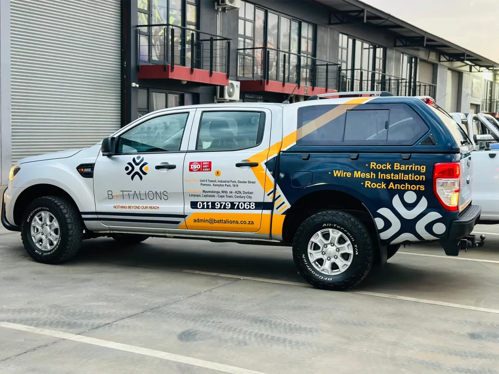
Unified Color Palette: Deep navy blue, vibrant orange, and clean white. This combination works across all vehicles, creating immediate brand recognition. The navy conveys professionalism and technical expertise, the orange ensures visibility and energy, and the white provides contrast and breathing room.
Geometric Brand Pattern: The Battalions logo features an abstract geometric pattern that becomes the visual anchor across the entire fleet. This pattern appears consistently on every vehicle, scaled appropriately for each surface but always recognizable.
Dynamic Diagonal Elements: Bold orange and white diagonal stripes create movement and energy. These diagonal elements are the design signature that ties the fleet together. Whether on a bakkie door or a van side panel, these stripes create instant recognition.
Consistent Information Architecture: Every vehicle displays the same core information in the same hierarchy: company name, tagline, services, contact details, geographic reach, and ISO certifications. The placement adapts to vehicle type, but the information remains consistent.
The Critical Elements of Fleet Consistency
What makes this fleet branding work across different vehicles? Several key strategies:
Color Ratio Consistency: Regardless of vehicle type, the ratio of navy to orange to white remains roughly consistent. This creates the same visual “feel” across the fleet, even though the actual surface areas differ dramatically.
Logo Placement Strategy: The geometric logo pattern appears in similar positions relative to each vehicle’s proportions on doors, on rear panels, anchoring key sections. It becomes the visual constant that ties everything together.
Typography Consistency: The same fonts, the same text treatments, the same color applications for different types of information. Service listings always use yellow on navy. Contact details always use specific font sizes and colors.
Diagonal Element Continuity: Those orange and white diagonal stripes are the design signature. By maintaining the same angle and width proportions across vehicles, we create instant recognition even from a distance.
Information Hierarchy: Every vehicle follows the same information priority: brand identity first, services second, contact information third, geographic reach fourth. This consistency means the fleet “reads” the same way regardless of vehicle type.
Key Lessons in Fleet Branding
Design for Adaptability: Create a visual system with elements that can flex across different vehicle types while maintaining recognition.
Color Consistency is Non-Negotiable: Exact color matching across all vehicles is essential. Close enough isn’t good enough in fleet branding.
Proportional Thinking: Design elements must scale proportionally to each vehicle type. What works on a bakkie door must be recalibrated for a van panel.
Information Hierarchy Unity: The same information in the same priority order across all vehicles creates coherent fleet messaging.
Quality Standards Apply Universally: Whether branding the smallest or largest fleet vehicle, installation quality must be identical.
If you would like to see examples of our fleet branding work or discuss your own project, you can view our portfolio or contact us to get started.
