When Hiteka Kitchen, a healthy school lunch partner, needed vehicle branding that would reflect their fresh, vibrant approach to nutrition, they wanted something that would immediately communicate their values: health, freshness, and fun.
Here’s how we transformed their Kia Picanto into a rolling brand statement.
Understanding the Brand
Hiteka Kitchen operates in a unique space, they’re not just delivering food, they’re delivering nutrition and peace of mind to parents. Their service focuses on providing healthy, balanced meals to school children, which means their branding needed to appeal to both parents making purchasing decisions and kids who would be excited about the meals.
The challenge was creating something vibrant and fun enough to catch attention and appeal to children, while maintaining the credibility and trustworthiness that parents expect from someone providing their children’s daily nutrition.
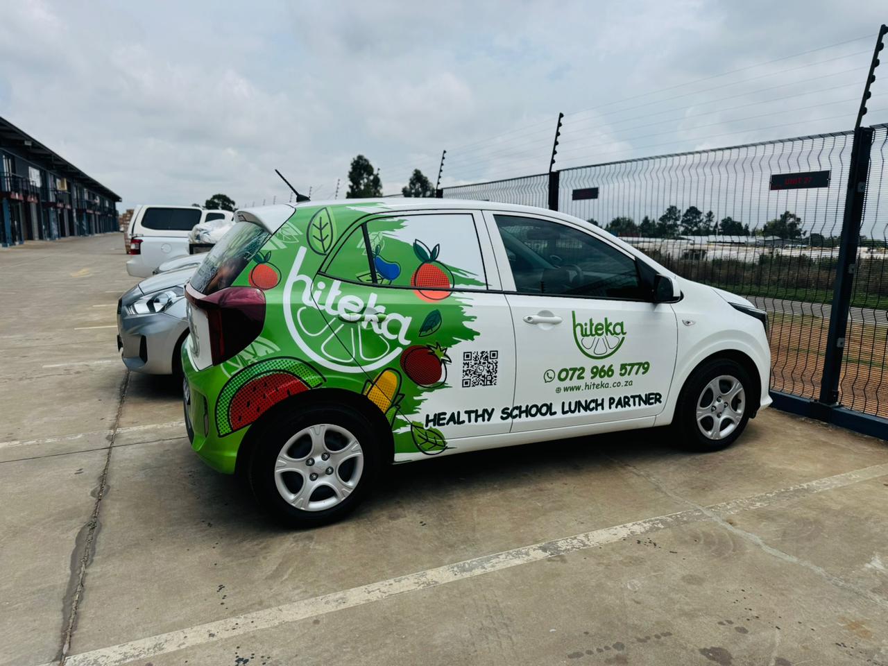
The Design Concept

")
We developed a design that balances playfulness with professionalism, using bold graphics and bright colors that stand out in school parking lots and residential areas.
Color Palette: We went with a fresh, vibrant green as the primary color, a natural choice that instantly communicates health, freshness, and nutrition. The green gradient creates visual depth and interest, while the white panels provide contrast and space for essential information. This combination ensures the vehicle is highly visible while maintaining a clean, professional appearance.
Fruit Illustrations: The design features colorful, illustrated fruits including oranges, watermelon slices, and other produce. These aren’t just decorative, they immediately communicate what Hiteka Kitchen is about: fresh, healthy, natural food.
Organic Elements: The tree and leaf motifs woven throughout the design reinforce the natural, healthy positioning. These elements create movement and flow, giving the design energy without overwhelming the core message.
Logo Integration: The Hiteka logo, featuring a citrus slice design, is prominently displayed on both the side and rear of the vehicle. The circular logo shape complements the fruit illustrations and creates a cohesive visual language. Multiple placements ensure brand visibility from every angle.
Clear Messaging: The tagline “HEALTHY SCHOOL LUNCH PARTNER” is displayed prominently in bold lettering. This immediately communicates what Hiteka Kitchen does. Parents seeing this vehicle instantly understand the service.
Contact Information: Phone number, website, and QR code are strategically placed for easy visibility and accessibility. The QR code is particularly smart, parents can scan it directly from the vehicle to learn more or place orders on whatsapp.
Material and Installation
For a delivery vehicle that’s on the road daily, durability is essential. As always we use high-quality vinyl that can withstand frequent washing, weather exposure, and the general wear and tear of daily operations.
The installation required careful attention to the vehicle’s contours, particularly around the rear windows and bumper area where the green panels needed to conform smoothly. The white sections were kept clean and bubble-free, ensuring a professional finish that reflects the quality of Hiteka Kitchen’s service.
The Results
The finished vehicle accomplishes exactly what Hiteka Kitchen needed. It’s impossible to miss, the bright green and colorful fruit illustrations ensure visibility in any environment. More importantly, it communicates the brand message instantly. Anyone seeing this vehicle understands immediately that it’s about healthy food for children.
That word “fresh” captures the essence of what this design achieves. It looks fresh, feels fresh, and communicates freshness. For a business built around healthy, fresh food, that’s perfect alignment between brand promise and visual identity.
Key Lessons from This Project
Match Design to Audience: The playful, colorful approach works perfectly for a children’s food service. A more corporate design would have missed the mark. Understanding the target audience shaped every design decision.
Strategic Partial Wraps Work: You don’t always need a full wrap to create impact. Strategic use of color and graphics in key areas can be just as effective while managing costs.
Clear Communication Wins: The “HEALTHY SCHOOL LUNCH PARTNER” tagline leaves no ambiguity. Sometimes the most straightforward approach is the most effective.
Color Psychology Matters: Green was the obvious choice for a health-focused brand, but the specific shade and how it’s used make the difference between generic and memorable.
Make Contact Easy: QR codes, phone numbers, and websites need to be clearly visible and easy to capture. The vehicle should facilitate customer action, not just look good.
